Data Journalism
Chris Knox
Data Editor at the New Zealand Herald (in August 2019)
chris@functionalvis.com
13 September, 2019
Recap
- If you can only remember one thing, remember Figure.NZ
- If you can only remember two things, remember to add
/data.csvto Figure.NZ urls
Data processing
- Make a copy of your original data
- Delete unnecessary columns (but don’t forget what the units were)
Do you need a pivot table?
Sometimes data jobs like this:
| Year | Variable | Value |
|---|---|---|
| 2016 | tui | 10 |
| 2016 | kereru | 15 |
| 2016 | kākā | 8 |
| 2017 | tui | 12 |
| 2017 | kereru | 11 |
| 2017 | kākā | 13 |
When what you need is:
| Year | tui | kereru | kākā |
|---|---|---|---|
| 2016 | 10 | 15 | 8 |
| 2017 | 12 | 11 | 13 |
Then it is time for a pivot table.
- Select all the data your need to pivot
- Click on ‘Data’ -> ‘Pivot table’
- Select your columns - probably the variable name
- Select your rows - probably time
- Select your values - probably value
- Deselect the ‘Create totals’ options
- Copy the result into datawrapper
What is a graph?
Using the tools at hand; size, colour, shape, and position to represent (encode) the values in the data.
Coloured pencil time
Chart choice
- Different charts will highlight different aspects of your data more effectively.
- Choose the chart that shows the aspect of the data that you are interested in
- Line and Bar charts are often a safe choice
- Take care with maps and pie charts
Bad or deceiving charts
- Charts and graphs can be used to deceive
- Don’t do this.
The best way to get a sense for bad charts is to peruse vis.wtf or /r/dataisugly. There is also a good writeup here
The most common bad things are:
- Incorrect, missing, or misleading labels
- Inconsistenct scales
- Truncating scales
- Comparing things that shouldn’t be
- Too many things
A few rules
- Barcharts always start at 0
- Line charts don’t need to start at 0, but always ask yourself if the range you select is going to make an insignificant change look important
- Only use pie charts for parts of a whole and only when there are less than 5 categories
- Avoid maps for showing quantities
- LABELS
Exercise
Pick a couple of charts from Figure.NZ and remake it.
- Have you made them better or worse?
- If you have improved them is the data being shown in a different way?
Workbench
- Workbench Data is built for journalists
- Replaces spreadsheets in your workflow
- Pivot is called reshape
This is long data
| Year | Variable | Value |
|---|---|---|
| 2016 | tui | 10 |
| 2016 | kereru | 15 |
| 2016 | kākā | 8 |
| 2017 | tui | 12 |
| 2017 | kereru | 11 |
| 2017 | kākā | 13 |
This is wide data
| Year | tui | kereru | kākā |
|---|---|---|---|
| 2016 | 10 | 15 | 8 |
| 2017 | 12 | 11 | 13 |
Maps
Data wrapper supports 3 types of map
- Choropleth
- Symbol
- Locator
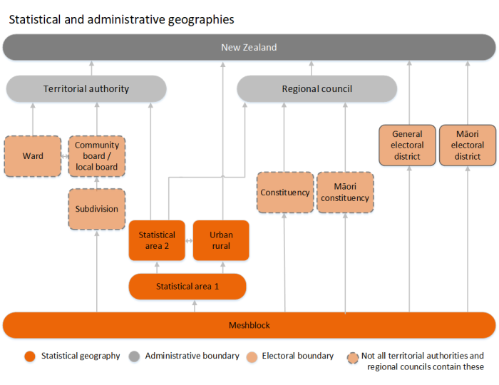
New Zealand is a mess (this doesn’t cover DHBs, Police Districts, Civil Defense, or Fire and Emergency areas)
Ask for help!
Accessment
- Select some data from Figure.NZ
- Create a chart, map, or table from the data in Datawrapper
- Email the chart link to chris.knox@nzherald.co.nz
- Include a sentence about why you choose this data - why would it be newsworthy
- Include a sentence about why you choose that chart or map type.