Recap
- What is a chart?
- Workbench
- Maps
Telling stories with data
Video examples
Interactive examples
Breakout
In pairs discuss these:
- What do you think of these approaches?
- Do you like them?
- Are there other ways you would prefer to learn about this data?
- Are they journalism?
- Are they news?
NZH Improvements
I probably should have included a median income version as well as an average income version.
Digressions — Why?
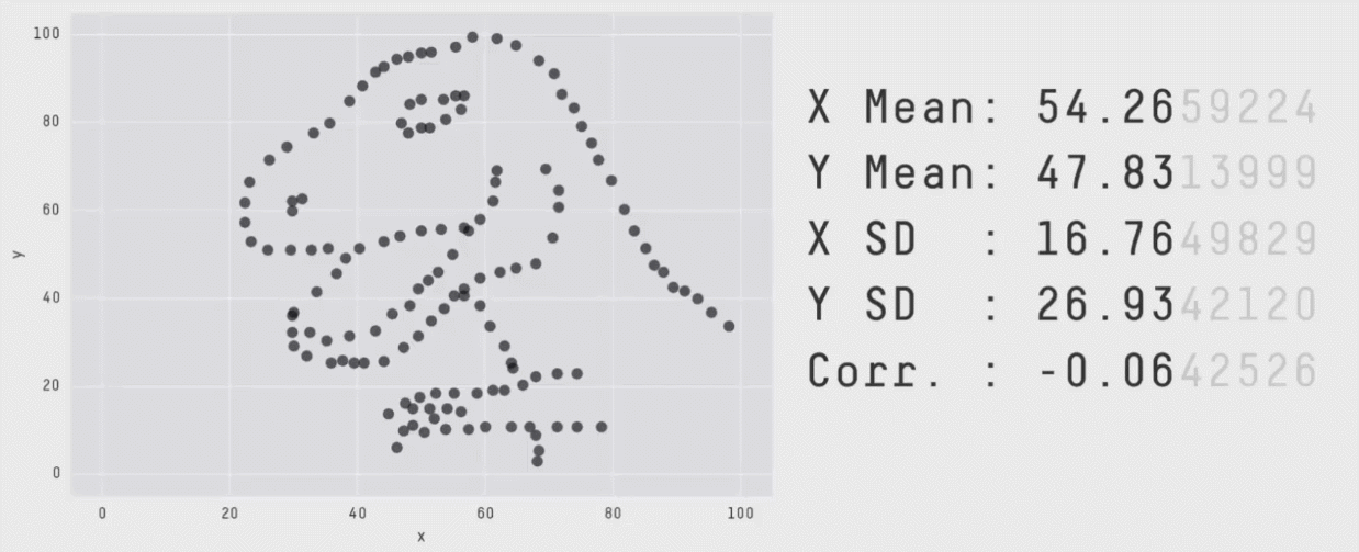
All summary statistics hide things
The mean and standard deviation are the same for each of these graphs
Back to Labour vs National
How would you do that?
- First look on Figure.NZ
- Follow back to Stats NZ
- Stats NZ has two primary data sources
- (At this point you can call StatsNZ)
- Look in the income sections and look for household income
Data tables have overly complicated names like:
Household income by region, household type, and source of household income
This is useful if you want to do something about regions - but often we just want to look for
totals.