Introduction to making charts with datawrapper
Outline
- What is data journalism?
- Using data in stories
- How to use Datawrapper
- Locator maps
- Graphs
- Tables
- A few guidelines
- What are charts?
- How do we find data in New Zealand?
- Where to go from here
What is data journalism?
Paul Bradshaw from Birmingham City University says:
Data can be the source of data journalism, or it can be the tool with which the story is told — or it can be both.
The Bureau of Investigative Journalism says:
Data journalism is simply journalism.
The former is a new and trendy term but ultimately, it is just a way of describing journalism in the modern world.
A few examples of data journalism
Why did I decide to move from data science/visualisation to journalism?
Marino Rivera’s Cutter
I went to a talk by Amanda Cox, from the New York Times and one of the stories she showed was this look at Mariano Rivera’s Cutter
What roles does data have in journalism?
- More and more stories need (or are enhanced by) analysis and communication of data.
- Data can serve as the primary source for an story.
- Data can also be the used to tell the story
- Or it can do both
Data journalism doesn’t need to be big and fancy
Some Herald stories that use data:
I think there are three distinct classes of data journalism:
- Data collection
- Data analysis
- Data presentation/story-telling
Most stories involve all three, but if you are getting started focus on just one.
Why use charts?
Exercise
Company A has 10 employees. Each employee earns $100,000 per year. What is the average salary?
Company B has 10 employees. 9 employees earn $10,000 per year. 1 employee earns $910,000 per year. What is the average salary?
Company A has a good year and applies an average salary increase of 10% - everyone now earns $110,000.
Company B has a good year and applies an average salary increase of 10% - 9 people still earn $10,000 and 1 person earns $1,010,000.
This year’s Auckland rates increases are a recent real life example of hiding behind the average.
Digressions — Why?
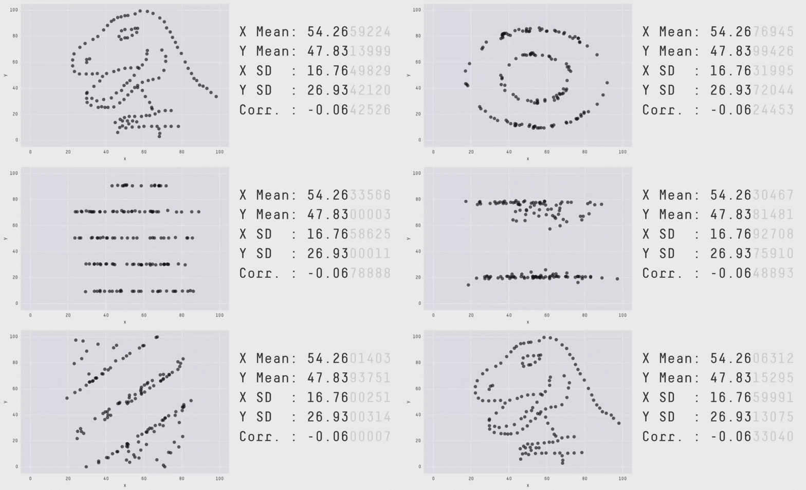
All summary statistics hide things
The mean and standard deviation are the same for each of these graphs
What is a chart?
- Or what makes something a visualisation as opposed to a graphic?
A chart (sometimes known as a graph) is a graphical representation for data visualization, in which “the data is represented by symbols, such as bars in a bar chart, lines in a line chart, or slices in a pie chart”.
Practical examples
Datawrapper
- Charts
- Maps
What about can we do with AI?
I want to create an article that has the same feel as this reuters article https://www.reuters.com/graphics/USA-ENVIRONMENT/COLORADO-RIVER/znpngebyxvl/. Create a webpage skeleton and configure any tools I need to do. I do not what you to insert any text or data - just clearly should placeholder graphics and steps. Reuters documents it’s graphics components here https://reuters-graphics.github.io/graphics-components/?path=/docs/intro–docs and their code is https://github.com/reuters-graphics/graphics-components use this to setup a page for me and then I will give you the text and charts and data I want to include. Remove any reuters branding
- Inspiration
- Docs
- [Code](I want to create an article that has the same feel as this reuters article https://www.reuters.com/graphics/USA-ENVIRONMENT/COLORADO-RIVER/znpngebyxvl/. Create a webpage skeleton and configure any tools I need to do. I do not what you to insert any text or data - just clearly should placeholder graphics and steps. Reuters documents it’s graphics components here https://reuters-graphics.github.io/graphics-components/?path=/docs/intro–docs and their code is https://github.com/reuters-graphics/graphics-components use this to setup a page for me and then I will give you the text and charts and data I want to include. Do this is a folder called demo01)
Chart choice
- Different charts will highlight different aspects of your data more effectively.
- Choose the chart that shows the aspect of the data that you are interested in
- Line and Bar charts are often a safe choice
- Take care with maps and pie charts
Bad or deceiving charts
- Charts and graphs can be used to deceive
- Don’t do this.
The best way to get a sense for bad charts is to peruse vis.wtf or /r/dataisugly. There is also a good writeup here
The most common bad things are:
- Incorrect, missing, or misleading labels
- Inconsistenct scales
- Truncating scales
- Comparing things that shouldn’t be
- Too many things
A few rules
Barcharts always start at 0
Line charts don’t need to start at 0, but always ask yourself if the range you select is going to make an insignificant change look important - or could the values be reasonably expected to reach 0.
Example: Drinks per person
Only use pie charts for parts of a whole and only when there are less than 5 categories
Avoid maps for showing quantities
LABELS - you are a journalist!!!
What about AI?
If you encounter something that you want to do and can’t think about trying vibe coding.
Claude is currently (probably) the best place to start.
Inspiration
Where do we find data in New Zealand?
- Figure.NZ (If you can only remember one thing from this talk, remember this)
- Stats NZ
- Justice
- Data.govt.nz
- policedata.nz