Visualising the Election
Chris Knox
Data Editor at the New Zealand Herald (in Novemeber 2020)
chris@functionalvis.com
25 November, 2020
Let’s look at the actual visualisations
Two homepage elements
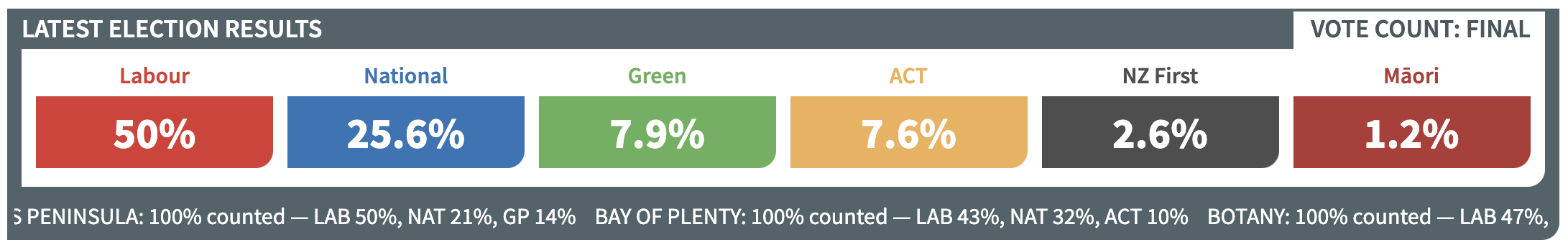
Summary with Ticker
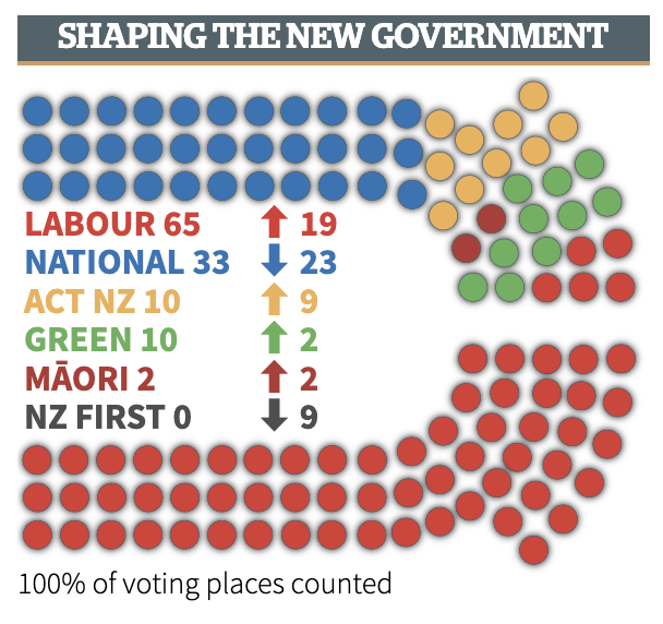
Parliament view for the homepage
A big data article
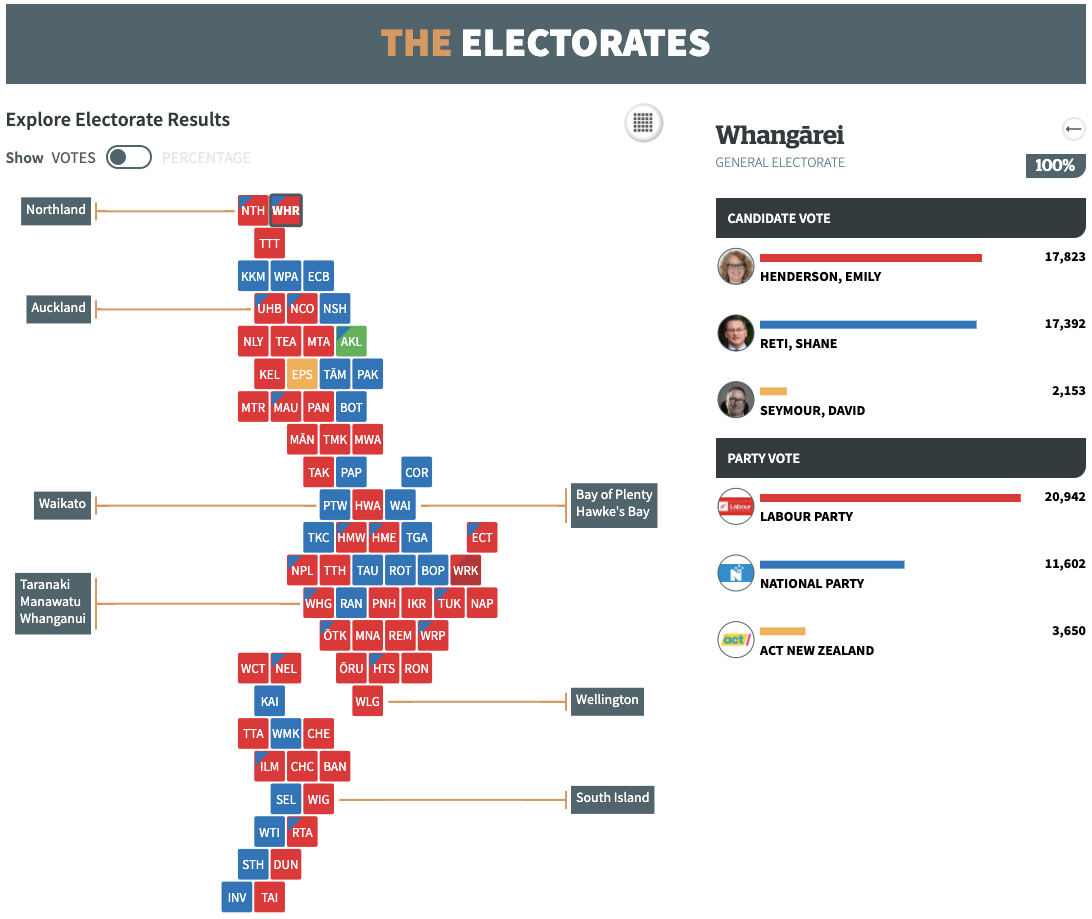
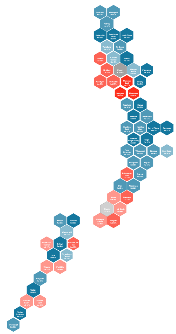
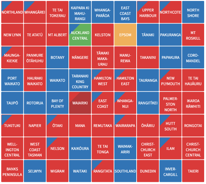
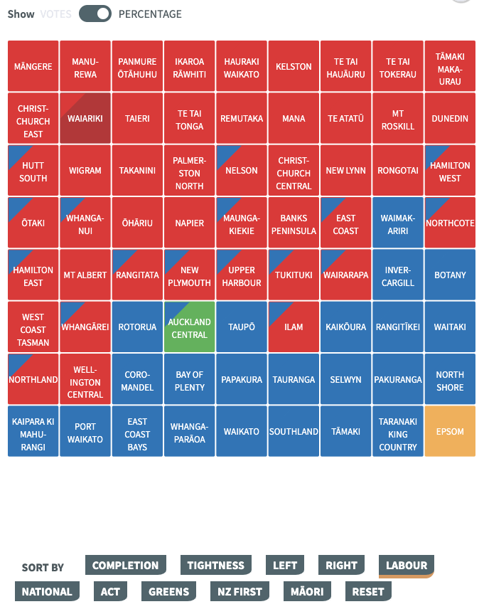
An Electorate Tilemap
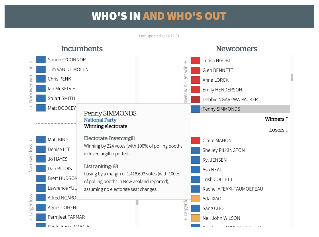
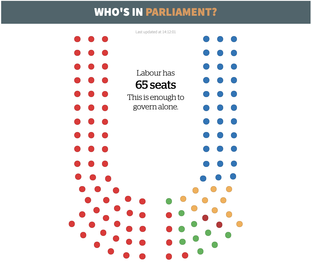
Who’s in and Who’s Out?
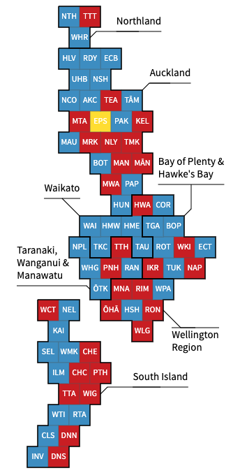
Detailled Parliament
Visualisation Requirements
- What is the first thing readers want to know?
Who’s winning?

But what does winning look like under MMP/a system that creates coalitions?

Our 2017 visualisations didn’t do enough to make it explicit that although National had the most votes it didn’t mean they automatically formed a government.
Let’s create a coalition builder
There was no coalition builder

We started on it but based on the polls took a gamble and decided not to build it.
Hot Take
MMP makes for (mostly) boring election visualisations
All you need is this
(This is probably a sign of a good electoral system)
- We did discuss creating more of a visualisation but it was decided that what most readers wanted to see first was just how each party was doing.
So what are the requirements?
- Quick summary
- Everything on mobile
- Fast(est) results
- What do the results mean?

- Automatically updating visualisations
- Support hundreds of thousands of readers
- Visual overview of electorate results
- Ability to explore electorate results
Engineering election night visualisations

Data source
The Electoral Commission provides the data as XML
- We don’t want to send that XML to our readers
- I don’t want to parse XML in javscript
- The Electoral Commission doesn’t want us to connect thousands of readers to their servers
Server load
- We need to support hundreds of thousands of readers and then essentially nothing
- We also want to minimise our bandwidth bill
I reckon the only (sensible) way to do this is push everything to a CDN
- Code runs on a server and converts XML into JSON and CSV and then writes this to AWS S3 buckets
- Data is served from S3 via a CDN
- Large data files are cached (for a month)
- this stops readers downloading files they already have
- this reduces the cost of S3 -> CDN transfers
- Small files are not cached
- A small index file is used to point to the latest results
- Client-side code downloaded these files every 30 seconds (until midnight)

Aside: Choice of programming language
7pm on election night is very stressful
Haskell
- Haskell is fast(ish)
- The Electoral Commision also provides high quality DTD files along with their XML files
- Using Haskell and the DTD files it is relatively easy to encapsulate the entire state of the system in code so that all possible scenarios are handled
- This isn’t true of Python
Designing Election Visualisations
Maps
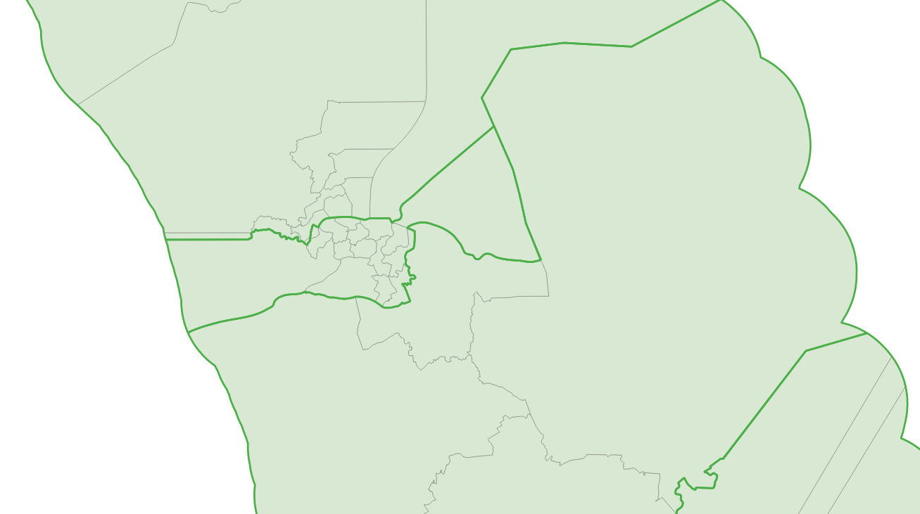
New Zealand Electoral geography is a pain

- New Zealand Electorates are designed to each contain roughly the same population
- Lots of New Zealand is sparsely populated
- Historically rural electorates have voted differently to urban ones
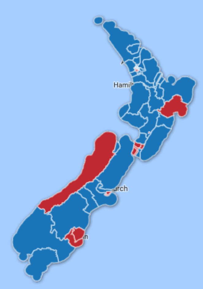
2017 Electorate Results
National’s 41 versus Labour’s 29
Tilemaps
Each electorate has the same population so each electorate should take the same area on a map
Hexes or Squares
- Hex based tilemaps are quite common for election results and have been used well in the UK and Germany
- Chris McDowell tried an NZ electorate tilemap
Chris was not happy with it.
It also won’t be great on mobile.
Squares work better for New Zealand
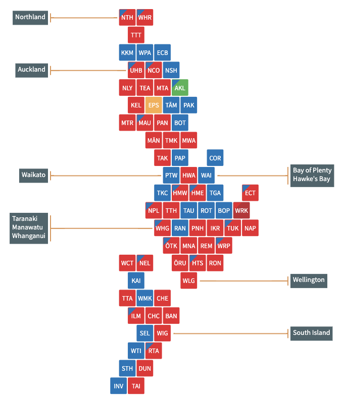
Especially when there are 72 electorates!
Building a Tilemap
I tried a few automatic layout approaches but:

In addition I wanted to include Māori electorates in the same make which broke many algorithms
I spent a lot of time looking at the General Electorates and Māori Elecotorates and lining up the tilemaps
And then sending the map to various people who hadn’t seen it to get first impressions
Aside: Corners for previous results
The 2020 tilemap was an evolution of our 2017 ones
Interestingly it wasn’t until we incorporated the corner triangles that showed the previous result that readers got really enthusistic about the tilemap
Other Features: Zoom and Support
Regional Zoom
Sort by ??
Visualisation Implementation
- Small components and tilemap implemented in Svelte
![]()
- Who’s in who’s out and detailled parliament implement in D3

Questions