Data journalism at the New Zealand Herald
Chris Knox
Data Editor at the New Zealand Herald (in January 2020)
chris@functionalvis.com
30 January, 2020
import ChancesAre from “../massey-journalism-2019/ChancesAre” import Venn from “./Venn”
Herald Data Journalism
At the New Zealand Herald
Chris Knox
Data Editor/Head of Data Journalism
The Data Team
Making complicated things understandable and engaging
- The Herald was two Wellington based data journalists - Keith Ng and Chris Knox
- Feel free to ping us via email, slack, twitter or the phone
- Or use a zoom call to have us walk you through chart creation
What is data journalism?
Paul Bradshaw from Birmingham City University says:
Data can be the source of data journalism, or it can be the tool with which the story is told — or it can be both.
The Bureau of Investigative Journalism says:
Data journalism is simply journalism.
The former is a new and trendy term but ultimately, it is just a way of describing journalism in the modern world.
Why use data in stories?
- Data is the story
- Fact-checking/importance checking
- Context
- Trust
- Clarity and/or conciseness
- Engagement
Data is a source
- Trust your instincts
- Don’t use it out of context
- One number by itself is often misleading
- Be skeptical
What does data give the narrative?
Narrative/Cognitive tension?
Not sure exactly what to call it - but I think it is important.
Inspiration
Break it down
How can you use data at the Herald?
Finding data
- figure.nz
- New Zealand’s best collection of data
We’re always here to help journalists find and understand data, too. We can answer questions on here [twitter], or feel free to email us on data@figure.nz
- New Zealand’s best collection of data
Datawrapper
Simple interactives
Graphics Team Collaboration
Investigations
Maps
Interactive story-telling
What is a visualisation?
Using the tools at hand; size, colour, shape, and position to represent (encode) the values in the data.
Why do we need visualisations?
- Often they are the best way to communicate things
- Summary statistics (mean/median) always hide things
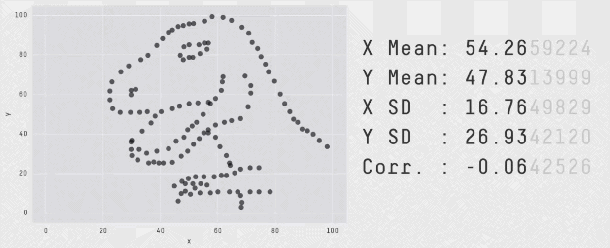
Chart choice
- Different charts will highlight different aspects of your data more effectively.
- Choose the chart that shows the aspect of the data that you are interested in
- Line and Bar charts are often a safe choice
- Take care with maps and pie charts
Bad or deceiving charts
- Charts and graphs can be used to deceive
- Don’t do this.
The best way to get a sense for bad charts is to peruse vis.wtf or /r/dataisugly. There is also a good writeup here
The most common bad things are:
- Incorrect, missing, or misleading labels
- Inconsistenct scales
- Truncating scales
- Comparing things that shouldn’t be
- Too many things
A few rules
- Barcharts always start at 0
- Line charts don’t need to start at 0, but always ask yourself if the range you select is going to make an insignificant change look important
- Only use pie charts for parts of a whole and only when there are less than 5 categories
- Avoid maps for showing quantities
- LABELS
- titles, captions, and labels are what guide readers into your chart